Membuat Labels Widget Dengan Effect Keren
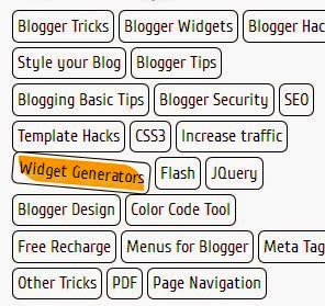
Label adalah daftar yang menampilkan kategori postingan blog kita. Membuat label membantu untuk mengkategorikan posting dalam kelompok. Sehingga hal ini membantu pengunjung untuk melihat posting di bawah kategori. Bawaan blogger Label widget tidak begitu bergaya. Jangan khawatir, di sini saya berbagi beberapa label yang menarik dan keren hanya untuk sobat semua. Label widget ini menggunakan kode CSS sederhana. Untuk menerapkannya di blog sobat ikuti langkah-langkahberikut ini :


- Pertama pastikan sobat harus sudah memasang widget Labels di blog
- Kemudian silahkan sobat pergi ke halaman Template -> Edit HTML
- Temukan kode ]]></b:skin> gunakan Control F untuk menemukannya
- Setelah itu, copy salah satu kode dibawah ini dan letakan di atas kode ]]></b:skin>

.Label li {
background: linear-gradient(to bottom, #6B6B6B 0%, #6B6B6B 4%, #333333 1%, #2B2B2B 100%) repeat scroll 0 0 transparent;
border: 1px solid;
border-radius: 6px 6px 6px 6px;
float: left;
font-size: 116%;
list-style: none outside none;
margin: 2px;
padding: 4px;
transition: all 0.3s ease 0s;
}
.Label li:hover {
transform: rotate(351deg) scale(1.7);
}
.Label a {
color: #fff;
text-decoration: none;
}

.Label li:before {
background-image: -moz-linear-gradient(left top , #FEDA71, #FEBA47);
border-bottom: 1px solid #D99D38;
border-left: 1px solid #D99D38;
content: "";
height: 1.39em;
left: -0.69em;
position: absolute;
top: 0.2em;
transform: rotate(45deg);
width: 1.3em;
z-index: 1;
}
.Label li:after {
background: none repeat scroll 0 0 #FFFFFF;
border: 1px solid #D99D38;
border-radius: 4.167em 4.167em 4.167em 4.167em;
box-shadow: 0 1px 0 #FAEABA;
content: "";
height: 0.5em;
left: -0.083em;
position: absolute;
top: 0.667em;
width: 0.5em;
z-index: 9999;
}
.Label li {
background-image: -moz-linear-gradient(center top , #FEDA71, #FEBA47);
border-bottom: 1px solid #D99D38;
border-radius: 0 0.25em 0.25em 0;
border-right: 1px solid #D99D38;
border-top: 1px solid #D99D38;
box-shadow: 0 1px 0 #FAEABA inset, 0 1px 1px rgba(0, 0, 0, 0.1);
color: #996633;
float: left;
font-family: 'Helvetica Neue',Helvetica,Arial,sans-serif;
font-size: 0.75em;
font-weight: bold;
list-style: none outside none;
margin: 0 0 7px 20px;
padding: 0.417em 0.417em 0.417em 0.917em;
position: relative;
text-decoration: none;
text-shadow: 0 1px 0 rgba(255, 255, 255, 0.4);
z-index: 1;
}

.Label li:before {
background-image: -moz-linear-gradient(center top , #1E5799 0%, #207CCA 100%);
border-bottom: 1px solid #145091;
border-left: 1px solid #145091;
content: "";
height: 1.39em;
left: -0.69em;
position: absolute;
top: 0.2em;
transform: rotate(45deg);
width: 1.3em;
z-index: 1;
}
.Label li:after {
background: none repeat scroll 0 0 #FFFFFF;
border: 1px solid #3F6893;
border-radius: 4.167em 4.167em 4.167em 4.167em;
box-shadow: 0 1px 0 #B5D8FF;
content: "";
height: 0.5em;
left: -0.083em;
position: absolute;
top: 0.667em;
width: 0.5em;
z-index: 9999;
}
.Label li {
background-image: -moz-linear-gradient(center top , #1E5799, #207CCA);
border-bottom: 1px solid #145091;
border-radius: 0 0.25em 0.25em 0;
border-right: 1px solid #145091;
border-top: 1px solid #145091;
box-shadow: 0 1px 0 #CCE4FF inset, 0 1px 1px rgba(0, 0, 0, 0.1);
color: #996633;
float: left;
font-family: 'Helvetica Neue',Helvetica,Arial,sans-serif;
font-size: 0.75em;
font-weight: bold;
list-style: none outside none;
margin: 0 0 7px 20px;
padding: 0.417em 0.417em 0.417em 0.917em;
position: relative;
text-decoration: none;
text-shadow: 0 1px 0 rgba(255, 255, 255, 0.4);
z-index: 1;
}
.Label a:hover
{
text-shadow:5px 5px 5px #dcdcdc;
background:orange;
border:1px solid orange;
border-bottom-right-radius: 0px;
border-top-left-radius: 0px;
border-bottom-left-radius: 30px;
border-top-right-radius: 30px;
}
.Label li {
border: 1px solid;
border-radius: 6px 6px 6px 6px;
color: #000000 !important;
float: left;
font-size: 116%;
list-style: none outside none;
margin: 2px;
padding: 4px;
transition: all 0.3s ease 0s;
}
.Label a {
color: #000;
text-decoration: none;
}
.Label li:hover {
transform: rotate(5deg);
}

.Label a {
-moz-border-bottom-colors: none;
-moz-border-left-colors: none;
-moz-border-right-colors: none;
-moz-border-top-colors: none;
background-color: #7FBF4D;
background-image: -moz-linear-gradient(center top , #7FBF4D, #63A62F);
border-bottom-right-radius: 30px;
border-color: #63A62F #63A62F #5B992B;
border-image: none;
border-style: solid;
border-top-left-radius: 30px;
border-width: 1px;
box-shadow: 0px 1px 0px 0px #96CA6D inset;
color: #FFFFFF;
float: left;
font: 14px verdana;
height: 18px;
margin-bottom: 9px;
margin-left: 10px;
padding: 10px;
position: relative;
text-decoration: none;
transition: all 0.5s ease-in-out 0s;
}
.Label a:hover {
background: none repeat scroll 0% 0% orange;
border-radius: 0px 30px 0px 30px;
border: 1px solid orange;
text-shadow: 5px 5px 5px #DCDCDC;
}
.Label {
margin: 0px;
padding: 0px;
position: relative;
}
.Label li:hover {
transform: rotate(5deg);
}
.Label li {
float: left;
font-size: 116%;
list-style: none outside none;
transition: all 0.3s ease 0s;
}
Sekian dulu tutorial tentang Membuat Labels Widget Dengan Effect Keren. Jika sobat tertarik silahkan ambil scriptnya dan tinggalkan komentar.
Join the conversation